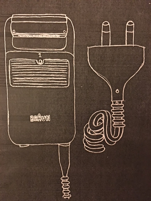
Graphic Design: In With The Old
I enjoyed this project very much. I didn't have a good idea about what graphic design really involved before this project. The project title was 'In With The Old' and we were asked by the tutor to pick a retro object and create a poster to advertise it. I really enjoyed using traditional methods of graphic design rather than PhotoShop and Illustrator which is what I would usually have associated graphic design with before this project.
Experimenting with colour, text and composition I found was really key in graphic design. Directing the eye of the viewer to the key features of the design was important, and could be helped by using shapes and symbols to guide the eye around the symbol. Overuse of colour was seen as too complicated and instead using two or three colours was the maximum ideal, to keep a theme and not to create too much chaos for the viewer.
Overall, the graphic design project really brought me out of my comfort zone and got me experimenting with lots of different designs in order to properly demonstrate my retro product. The more I experimented, the better my designs became which is a good thing to consider in future projects. I would rather be over-experimenting than overthinking the project, which is something I tend to lean towards.


Comments
Post a Comment